Tuesday, 25 January 2011

Assignment 2 : Elements of Design

I feel I have finally got to grips with the elements of design.  To start with my mind was focusing more on actual shapes rather than implied shapes and lines.

The more photographs you take and subsequently look at on the computer, the more it makes sense and becomes a more natural way of thinking.

I have chosen Raw Materials of Food as the subject for my assignment.

Single Point dominating the Composition


                                          Shutter 1/60 ...... f 5 ....... ISO 400

I was very happy with this picture, it was exactly what I was imagining and planning.  On my first outing I couldn't find a squash.  I did take other versions of this shot.  The first with a red pepper, which was not giving the exact single point that I wanted.
The other standby shot I had was the base of an orange, it was clear, well focused and a good colour.
This my final image, I have cropped the picture slightly, I did like the original but the background was a little distracting.

Two Points


                                                      Shutter 1/60 ...... f 4.0 .......ISO 400

Two points I found more difficult, especially with food stuffs.  This first picture that I had did lead your eye from one point to another, its the girl cooking the curry, first you look at the curry then onto the girl, but I not sure if they fit into the 'raw stuffs' category.
The Picture that I settled on is the following one, although i'm not a lover of cling film. This is my choice of picture for two points, of the melon halves.


                                                      Shutter 1/80 ....... f 7.1 ........ ISO 400


Several Points in a Deliberate Shape


                                          Shutter  1/60 ........ f 5.6. .....ISO 400


Thanks go to my local butcher who allowed me to take these pictures of his hams.  On driving past I noticed these and thought the would be perfect for this heading.  Several similar points all hanging in a curve shape.  They looked artificial but the butcher assures me they are real.


Combination of Vertical and Horizontal


                                           Shutter 1/60 ........f 4.0 .......ISO 400

The first picture that I had was of boxes of dates, stacked, giving vertical and horizontal lines. Also similarly at Borough Market there were boxes of Red currants, which looked delicious.  The picture I have chosen is one from the cheese stall, this was its shelving, stacked with various goodies.  The box housing gives the horizontal and vertical lines.


Diagonals


                                                     Shutter 1/100 ........ f 7.1....... ISO 400

This was taken at the market in Cambridge, first of all I included the box in my picture, but decided to go in really close, and this was my preferred picture.  They were set in a diagonal pattern in their box, also the diagonal is going across the picture.

Curves


                                          Shutter  1/60  ........ f 4.0 ........ISO 400


I had various pictures of fruit which in itself is curvaceous as were many of the fish, or the arch of the spines.  This picture that I have chosen is of the colourful Virgin Olive Oil cans on the curved stand and display.  I love the yellow and blue together.

Distinct, even if irregular, shapes.


 Shutter 1/100 ....... f 8 .......ISO 400

I thought these cups were good with the heading, the cup shape is regular, along with the orange colour of the juice, all makes them distinct.  The random angles of the straws makes them slightly irregular.


Two Implied Triangles


                                          Shutter 1/60 ....... f 4.0 ....... ISO 400

Here's hoping you are not a vegetarian !  
Initially I was looking at the pigs head as my triangle, using his two ears and nose.  The cheery butcher decided to continue his show and 'jazz hands' for me, he had been entertaining the children, but I still have my triangle, including his two hands and the pigs head.  


                                                      Shutter 1/60 ....... f 4 .0 ........... ISO 400 


This second picture is a reminder of my own back garden, I'm thinking of going into business ... Uppermost is the blackboard forming the apex of the triangle, with the two clusters of animals forming the other two points, giving the implied triangular shape.


Rhythm


                                                      Shutter  1/6 ....... f 4.0 .......ISO 400 

Lots of the fruits have rhythm, when its laid out on display, with its regular shapes all laid together, and constant colour. 
I picked the picture of the figs, because they were the nicest figs I've seen for a long while.. perfectly ripe and their beautiful soft green colour.  It is the colour and shape that gives the rhythm, along with the stalks.


Pattern


                                          Shutter  1/60 ...... f 4.0 ........ISO 400


There is pattern here firstly in the different types of mushrooms, which are then laid out in a stripe pattern, with herbs making a surrounding border.  Each individual section of mushrooms would make their own pattern also.


As I have realised before when initially reading through the exercises and assignments, you have ideas and ways you want to take your photographs but they don't always come to fruition when you have your camera in hand..

Also some of the ideas you have don't actually work when you look at them, which is quite disappointing.

The Implied Triangles and curves have now finally registered, I'm hoping with more practice they will feel more natural. Once you do get to grips with them its easier to see them in everyday situations, in photos that you take and ones that you see in the press, magazines and books.


ALTERATIONS TO ASSIGNMENT 2

Implied Triangle


Pattern


Rhythm 


Exercise : Rhythm and Pattern

The difference between Rhythm and pattern is that Rhythm is to do with movement across a picture, or the movement of the eye through the picture.  Whereas pattern is more static, and has to do with area.

My pictures are as follows :

Ryhthm


                                         Shutter  1/125 ....... f 5.6 .......ISO 400

The brickwork on this building is absolutely beautiful - in fact quite amazing.  It definitely has rhythm, each section is identical.


Pattern


First of all I had a picture of a wrought iron gate which had a pattern but I felt this was more like rhythm.
I settled for this shot of Lychees, lots of the fruit has pattern, its slightly irregular and has varied colours, but is a pattern in itself.

Exercise: Real and Implied Triangles

The triangle is an inherently strong shape that appears easily to the eye. Triangles can be formed in almost any configuration.
Here are my versions of Real and Implied Triangles.

Real 


                                          Shutter   1/125 ........ f 5.6........ ISO 400

The roof top and chimney form a triangular shape, which is repeated across the whole roof.


This is a triangle by perspective, looking up at the roof at Borough Market gives a triangular shape with the sign making the base of the triangle.


At last .... some blue sky !!

Inverted triangle by perspective, converging towards the bottom of the frame.
At last a  sunny day in Cambridge, this photo has two triangles, the first is the sunlit stonework, and the second is the surrounding wall set in shadow.  Here the shadowy area of the wall and the border of the photo frame makes the triangle.


Implied Triangles


My first shot was of balls of wool but this was an actual triangle - set up - rather than implied.  Then I settled on this picture, a still life of mixing bowls and mixer and scales.


Still life with Apex at the bottom.

I did start with a bunch of grapes which have that natural shape with apex at the bottom, but chose this picture, still life of Chocolate jugs. I do have a picture taken from above which shows a better triangle but i prefer this shot.


Arrangement of three people.

Lastly here is my picture of three people, their heads making a triangular shape.

Exercise: Implied Lines

Implied lines are not actually visible but you can image where I line might go if you had to draw one on a picture.  For instance the horses cantering around, the implied lines are going in the direction of the horses, to the place to which they are travelling.

My first picture is an eye line picture.  it is of Sir John Betjeman, at Kings Cross Station. Here he is looking up to the sky. This is the eye line, upward, skyward.


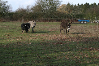
The second picture is an extension of a line.  Here the donkeys are walking towards me with the camera.  Your eye sees this direction that they are walking into and you look forward into the space.


I need to draw some lines on these pictures and I will return with two more pictures, with arrows.....

Exercise: Curves

Curves have a sense of movement and direction. They pull the eye and are useful in planned composition.
My first photograph is of a curved barrier, leading to an entrance.  Your eye is pulled towards the entrance in this gentle curve, the barrier is a modern structure in a very traditional setting.


Secondly, this was taken of a stand of Chocolate, so maybe it was that that was calling me in, rather than the curve.  But you eye is drawn in round the stand to look further, the same as if you were entering the shop to buy goods.


The next picture is a different view of the London Eye, again a gentle curve, but it shows movement, your eye follows the direction.


Lastly, my curve is a static curve, in a restaurant which isn't showing movement in anyway however, your eye does follow the curve, then it leads through the arch to view further on in the restaurant.

Exercise: Diagonals

Diagonal lines are easier to create in a photograph, as they depend mainly on viewpoint.
My first diagonal is one of the effect of perspective.  Here the building diminishes into the distance, giving a prominent angle.


                                                        Shutter 1/125 ........f 5.6..... ISO 400


                                          Shutter 1/60 ...... f 4.5 ........ISO 400


The photo above, the stairs are probably the most common of the diagonals. This is the side view of a double flight of stairs.  To Change the view I could have got very close with the camera and shot up the stairs, along the banister, for a different view.


                                                        Shutter 1/80  ....... f5.6 ...... ISO 400


More Stairs these more elaborate, combing diagonals and curve, painted bright yellow.. quite stunning against the grey background.


                                                      Shutter 1/60 ...... f 4 ...... ISO 400

These diagonal poles are not particularly strong diagonal but the effect is better as there is a row of them. I maybe could have cropped the picture more to make the poles make a diagonal across the frame of the picture.

Monday, 24 January 2011

Exercise: Horizontal & Vertical

Horizontal and Vertical lines are the simplest of lines, they tend to induce feelings of stability in an image.  They are all around us, sometimes very obvious, other times, not so.  Firstly, here is my selection of

Horizontal


                                          Shutter  1/100 .... f 7.1 ....  ISO 400

This beautiful building, the houses of parliament, make my first horizontal picture.  It fits the frame with the boat just breaking the water of the Thames, and set against an very rain filled sky.


                                          Shutter 1/125 ....f 8 .....ISO 400

This was taken on the pedestrian bridge at Embankment, These are the horizontal barriers, with the London view beyond.


Shutter 1/60 .... f 5.6 ..... ISO400 

The numerous bridges in London are all beautiful and i have used this for horizontal, but I could have used it for curves or even pattern.

                                                    Shutter 1/60....  f 4.0 ..... ISO 400

At Borough Market amongst the stalls, above was a strong iron Horizontal structure, here painted yellow.


Vertical 

The weather was closing in, but I liked how this photograph turned out, showing the vertical lines in the shadows.  A little on the dark side, but dramatic, with London just beginning to turn its lights on in the distance.

                                         Shutter 1/60 ..... f 5 ..... ISO 400


                                         Shutter 1/60 .... f 5.6 .... ISO 400

The very strong design here could be either horizontal or vertical, I have chosen it to be vertical as I feel this is the stronger element.  They are good colours too.


                                         Shutter 1/60 ...... f 8 .....ISO 400

Here is a line of beautiful, vertical, lamp posts, disappearing into the distance.  This would have looked nice against a blue sky, but hey this is January !!! I did get soaked shortly after this shot.

                                         Shutter 1/200 ...... f 5.6 ..... ISO 400

I went to the Tate Britain to see the Eadweard Muybridge exhibition, and the building here has these wonderful pillars, what an impressive entrance.

and just one more, I like this photo as you don't always see four phone boxes together, four verticals.


Exercise: Multiple Points

With several points the relationship is not so predictable.  A group of objects implies a network of lines and can also create a shape, by implication.

I started off with marbles on a patterned carpet, rolling the small marbles into the large marble, letting them form their own pattern.  I liked the pattern formed but found the carpet to be distracting.


In contrast my second set of pictures was on plain carpet, although I liked the pattern that was forming, I felt this was too plain... it just felt like I was staring down at the marbles.


Well finally decided on our Christmas game, Mancala, which has the perfect glistening counters to use.  I placed the counters alongside the board.  The table gave an interesting background without being too heavily patterned and therefore distracting.

                                          Shutter 1/60 ..... f 4 ...... ISO  400


This picture above shows the marbles are linked and I have shown on the last picture below with arrows.


This last picture has no set pattern...


Here the black counter takes your eye and then the other counters lead out from this, which I have marked with arrows.  They need to be fairly close to each other to stay connected.