Anyway battling against the greyness I did find some colour to produce my photos for this assignment. The colours I found most difficult to just come across were purple and orange.
I have been reading notes from 'The photographers Eye' and 'The essential colour manual for photographers' , along with the OCA notes, 'Basic Colour Theory'.
I found the Colour section very interesting and look at Tescos array of Bouquet arrangements with a whole new eye.
I feel I have learnt a lot. Things I didn't know before, like changing the exposure had an effect on the colour, and also I liked the filter effects on the primary colours in black and white and trying something new in Photoshop, which is still very new to me.
I do still tend to feel the pictures I am taking are for the colour combinations rather than the picture itself, but I do now feel more comfortable with my camera and will take more pictures generally, which I haven't been doing before.
I like most colour combinations and your choices for any photograph has to be dependant upon the picture you are trying to produce. For example you would probably choose pale, soft, similar colours when taking pictures with babies.
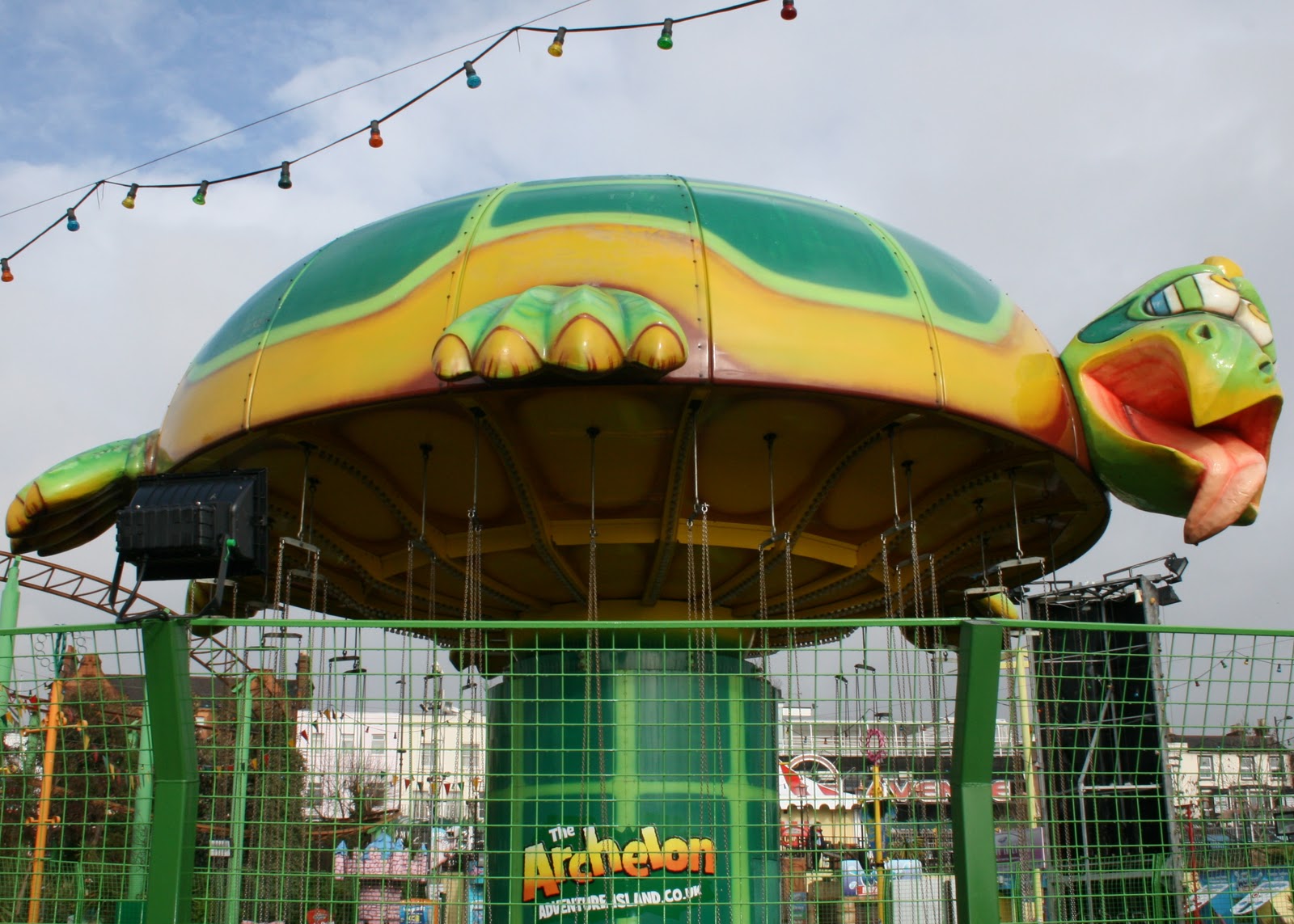
I had a trip to Southend to find some guaranteed colour !! Coincidently I bought a book that I had seen advertise in a magazine called 'Fairground Music, The World of Porthcawl Funfair.' The book is written by Robert Minhinnick who lives 200 yards from the funfair at Porthcawl, and the photographer is called Eamon Bourke.
Some of the photographs resembled mine which amused me somewhat, as I hadn't seen the book before I went. I have scanned a couple into my photo examples.
Here are my 'Colour' photographs, starting with complimentary.
COMPLIMENTARY
YELLOW AND VIOLET

RED AND GREEN

BLUE AND ORANGE

RED AND GREEN

SIMILAR
YELLOW AND ORANGE

YELLOW AND GREEN
BLUE AND GREEN

RED AND ORANGE

1/3 OF WAY ROUND COLOUR WHEEL
YELLOW AND BLUE

YELLOW AND RED

RED AND BLUE

GREEN AND VIOLET

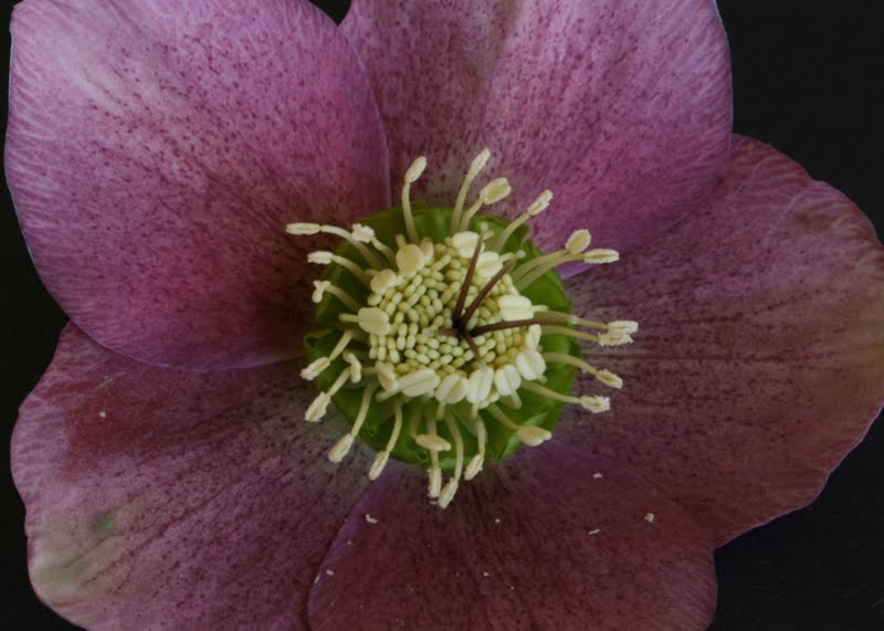
COLOUR ACCENT


I know this picture here goes against the colour ratios that we have just learnt about, I did take another picture with the yellow bloom being the single one, but the purple blooms were mostly closed, giving a different effect. I thought this picture worked well for this topic, even though the ratios were incorrect.
This last picture was supposed to be a red balloon against a brilliant blue sky - well that was the plan - but as I am still waiting for the blue sky I thought I would need to make an alternative. However if the blue sky does come anytime soon I may add another....
ALTERATIONS TO COLOUR ASSIGNMENT
Yellow and Violet
Red & Green

Yellow & Orange

Yellow & Green

Blue & Green

Red & Blue


